Greenspace’s legacy branding transforms South Boston’s industrial past into a future-forward urban district
 On The Dot legacy branding by Greenspace
London-based design consultancy Greenspace is making its mark in North America through an eight-year creative collaboration with real estate developer Core Investments, leading the transformation of a 22-acre South Boston industrial site into a dynamic mixed-use district called ‘On the Dot’.
The collaboration, which began in 2017, showcases how legacy brand thinking can shape not only perception but also place, community, and long-term value in real estate.
Core’s vision for the site was to create a game changing lifestyle destination in the heart of South Boston, reviving an industrial area that a century ago was an innovation and manufacturing powerhouse. Greenspace partnered with Core to work alongside its planning, architectural, engineering and landscaping design teams to create the overall On the Dot place strategy, branding, visual identity, marketing, and meanwhile site activations.
Once the development was granted the planning permission in 2024, Core Investment has established a joint venture with Chicago developer Sterling Bay, marking a new phase for the development of On the Dot, and its meanwhile neighbourhood space, The LOT.
The LOT on the Dot by Greenspace
A Legacy-Led Approach to Placemaking
Inspired by Dorchester Avenue, known locally as ‘Dot Ave’ or ‘The Dot’, Greenspace developed the name, strategy, and complete brand ecosystem for this ambitious project. The long-term place brand’s legacy-inspired narrative, “Creating communities to our core,” informed every design move, ensuring authenticity and emotional connection with locals and investors alike.
The work extends far beyond: Greenspace led on all creative for On the Dot, from web design and film-making, to site hoardings, print publications, and digital media. Greenspace also shaped the physical brand architecture for meanwhile spaces including The LOT, built on a disused parking lot, and an award-winning neighbourhood bar and restaurant, the Cannonball Café.
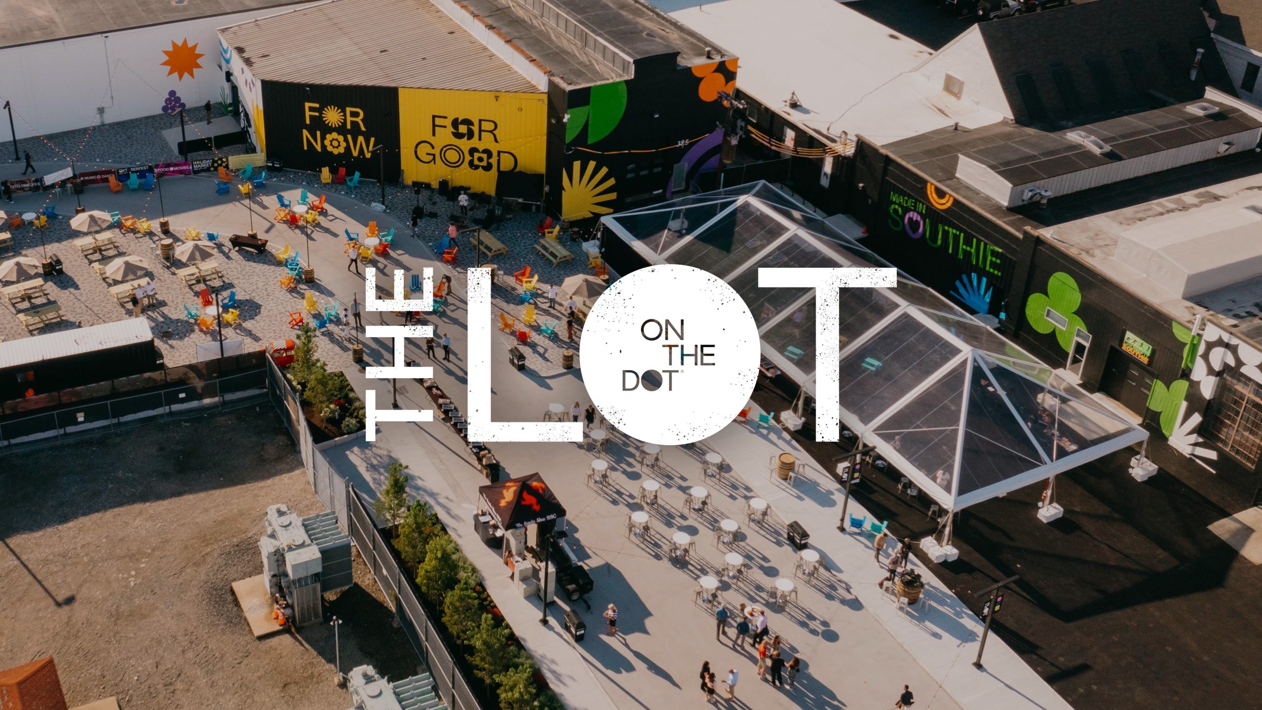
The LOT: building meanwhile activations with longevity at the core
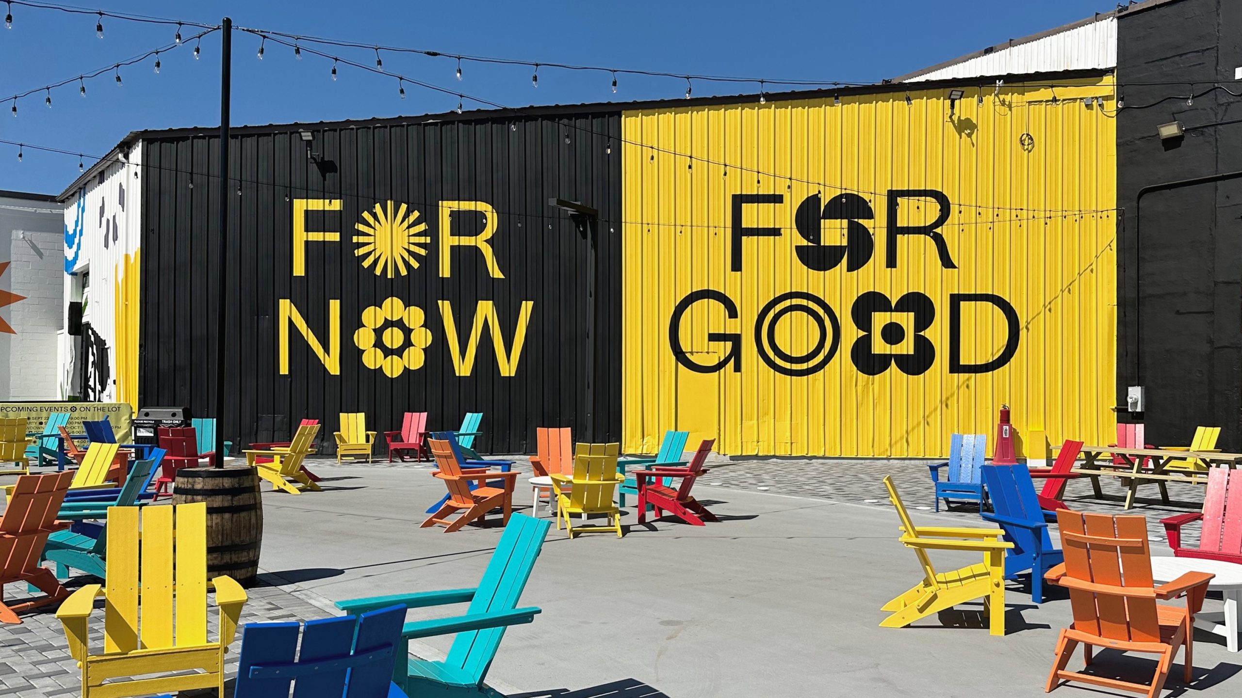
Since its foundation in 2003, Greenspace has worked at the forefront of meanwhile activation, developing experiential initiatives for urban spaces as part of long-term regeneration development planning. For On the Dot, Greenspace developed The LOT on the Dot, under the theme, ‘For Now, For Good’.
The LOT, launched in 2023, has reimagined a disused parking site as a vibrant meanwhile neighbourhood venue. The entire 3-acre space, landscaping, shipping containers, bars, stages, murals, and its accompanying visual identity was developed by Greenspace with a playful, modular design identity system that would easily adapt to events, weekly promotions, and the different seasons.
As part of The LOT, Greenspace designed the Cannonball Café to be a local landmark. Its visual identity and physical space were crafted by Greenspace, including the interior design and FF&E, packaging, merchandise, uniforms, and digital screens.
Since its launch, The LOT has drawn more than 20,000 visitors through a vibrant program of music, sports, food, and cultural events, breathing new life into a previously overlooked part of the city.
Now entering its third year, The LOT has matured into a year-round destination, attracting long-term partners providing indoor rock climbing, soccer, and pickleball sports, solidifying its place as a hub for entertainment and hospitality for the next decade.
In May 2025 BroadwayRestaurant Group will open Park City at The LOT, a 30,000 sq ft year round outdoor dining and music destination.
Meanwhile activations on THE LOT, under the theme For Now, For Good by Greenspace
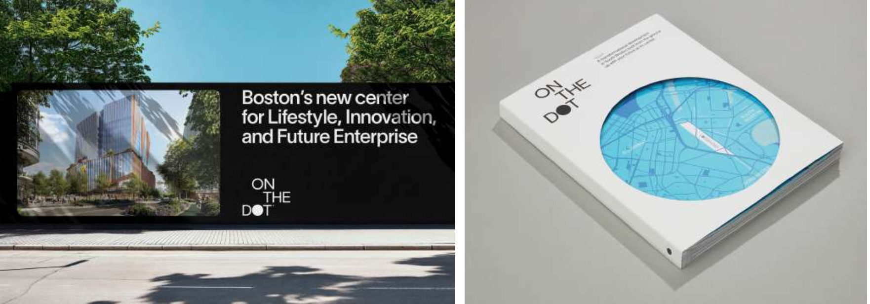
Legacy Place strategy, Place Branding and Visual Identity
On the Dot
For the 22-acre development, Greenspace designed a complete visual identity system including; name, place brand, brand guidelines, website, films, books, hoardings, newspapers, and digital tools, all rooted in the legacy brand idea, ‘Creating communities to our core’.
•Visual Language
The Dot is used as a framing device, both visually and conceptually, to represent ongoing activity On the Dot. Rounded corners and pill shapes echo this geometry subtly across layouts, avoiding visual fatigue. A custom icon set based on Dot geometry was also created for scalability across digital and environmental formats.
•Typography
Primary: Lausanne, a refined sans serif with unique personality, offering clarity and a modern tone.
Secondary: Caslon Ionic, a slab serif with historic resonance, connecting to Core’s appreciation for legacy and craftsmanship.•Colour Palette
A predominantly cool monochrome base is energised with four vibrant accent pairings, designed to reflect both the evolving community and future ambitions of the site. Black and white text use ensures consistency, even with bold colour usage.
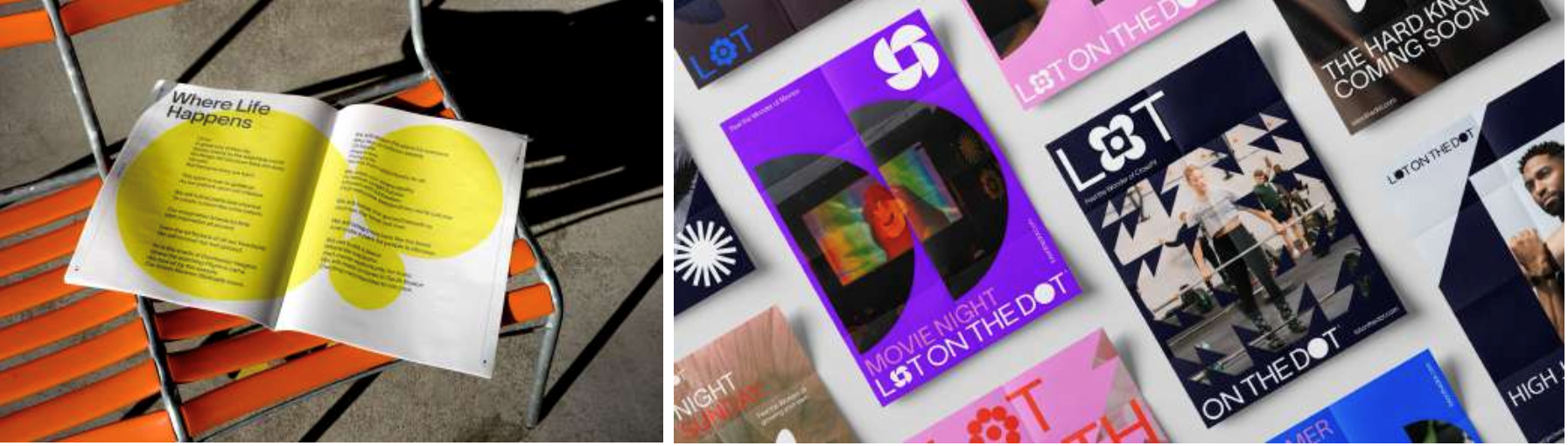
The LOT
•Designed as a playful sub-brand of On the Dot, The LOT’s identity features a mix of bold, geometric forms, always integrating a circle to tie back to the parent brand.
•The palette is rooted in black and white for flexibility and contrast.
•The LOT uses the On the Dot typeface system to maintain cohesion, while the shapes and colour applications bring an energetic, event-first vibe.
The LOT’s voice is also extended through a quarterly newspaper, distributed in print via local events and the Cannonball Café, and digitally through the On the Dot website – bringing the brand narrative into everyday community engagement.
Adrian Caddy, Founding Director, Greenspace, comments:
“It’s been a privilege to work along Core throughout the masterplan and inception phases of On The Dot; to witness meanwhile activations such as The LOT becoming a hub for a creative community is incredibly rewarding, and we’re looking forward to creating the legacy for the future of On the Dot as an exciting addition to Boston’s vibrant lifestyle.